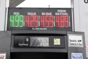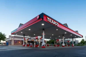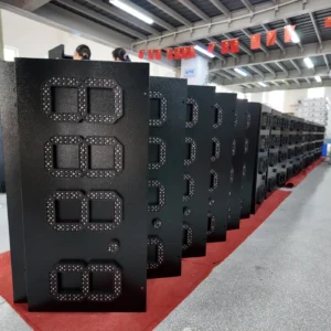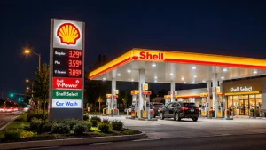
A station adds another fuel grade, but the roadside sign does not magically gain more space. Now the gas station pole has to carry the brand logo, more fuel names, and another row of digital prices. On paper, it may seem easy to add one more line. In practice, every extra row puts pressure on the layout.
That is why the real question is not simply how many prices a gas station pole can hold. The better question is how many prices it can display clearly without making drivers guess which number belongs to which fuel.
Gas Station Pole Rules: How Many Fuel Prices Must You Display?
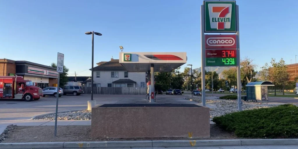
Before discussing cabinet size or LED layout, first confirm which fuel prices actually need to appear on the sign.
For example, the NSW Government states that service stations selling up to four fuel types must display the standard retail price for all of them. If more than four fuel types are sold, at least four prices must be shown, including E10, LPG, and diesel where applicable. The prices must also be visible to motorists approaching the station while it is open.
An important detail is that NSW allows these prices to be shown on one or more signs. That means not every required price must always be forced into one single gas station pole. This matters because some station operators assume all prices have to fit into one pylon cabinet, even when that creates a crowded layout.
Rules vary by market, so the first step is always to verify local price-display requirements. The design should follow the requirement, not the other way around.
Gas Station Pole Layout: More Price Rows Mean Less Room for Everything Else
Every added row takes space away from something else.
On a gas station pole, the main competition is usually between three elements:
- the station logo or brand panel
- the fuel-grade labels
- the price digits themselves
When the number of fuel grades increases, the layout often becomes tighter long before the cabinet looks full from a distance. That is because the sign still needs enough separation for drivers to quickly understand what they are seeing.
| Price rows | Main layout pressure | Design priority |
|---|---|---|
| Two | Balance between logo and prices | Keep branding and prices clearly separated |
| Three | Consistent label-to-price pairing | Align each fuel name with its price |
| Four | Reduced vertical space per row | Protect spacing and row separation |
| Five or more | Competition between logo area and price area | Rework the full layout, not just the digit area |
This is a design comparison table, not a legal limit table.
A common mistake is to think the answer is simply “make the fuel names smaller.” That may help the drawing fit, but it can weaken readability on the finished gas station pole. If drivers can see the digits but cannot quickly match them to the correct grade, the sign is doing less than it should.
Gas Station Pole Design: Give Fuel Names and LED Prices Their Own Space
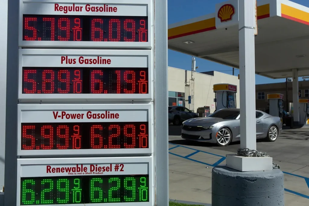
Price digits are only one part of the message. A gas station pole also has to help drivers understand what those digits mean.
That is why fuel names and prices should be treated as one visual unit. Each row should pair the grade label and the price in a stable, easy-to-follow arrangement. If the first three rows use one alignment method and the fourth row suddenly changes position, the sign becomes harder to scan.
Spacing also matters. When multiple price rows are stacked too closely, the sign may technically show all required information, but not communicate it cleanly. This is especially true when the sign also includes qualifiers such as cash price, card price, or promotional conditions. If a condition is required, it needs enough visual clarity to avoid misunderstanding.
The same issue applies to branding. The logo is important, but it should not squeeze the fuel information into leftover space. On a busy roadside sign, the brand should remain recognizable while the price area stays readable. That balance is one of the main layout decisions in any gas station pole project.
Gas Station Pole Example: What a Five-Row Pylon Can Look Like
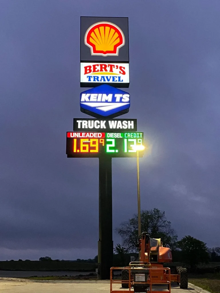
A useful real reference is Grandview’s Astron pylon sign project in Australia. That project used an illuminated upper brand section and five separate fuel price rows below it.
The displayed grades included Unleaded E10, Unleaded 91, Premium 95, Premium 98, and Premium Diesel. Instead of letting the price area consume the whole sign face, the layout gave the brand section its own zone and kept the price rows organized underneath. This is a practical example of how a gas station pole can carry more price information without turning into one dense block of text and numbers.
That does not mean the Astron size should be copied as a standard solution. The value of the example is the layout logic: separate the brand area from the fuel-price area, and give each price row enough structure to be read correctly.
Gas Station Pole Planning: When Should the Layout Change Instead of the Sign Size?
Not every crowded sign needs to become taller or wider.
In many cases, the better first step is to review the information order. Ask:
- Which prices must appear?
- Which labels are necessary?
- Is any promotional wording taking space away from required fuel information?
- Can the brand zone and price zone be reorganized more clearly?
If the required information still cannot fit cleanly, then the project may need a larger cabinet or a different sign arrangement. But changing a gas station pole is not only a graphic decision. It may also affect structure, mounting, permit review, and local installation conditions.
A manufacturer can help review the cabinet layout, price-row arrangement, and sign-face organization. Local engineers, installers, and approving authorities are the ones who must confirm site-specific structure, electrical work, and compliance.
A crowded layout is not just a design issue. It is a decision issue. When more fuel grades need to be displayed, the goal is not to fit the maximum amount of information onto one gas station pole. The goal is to present the required information clearly enough that drivers understand it at a glance.
FAQ
Can a gas station pole display five or more fuel prices?
Yes. A gas station pole can be designed to display five or more fuel prices if the layout is planned carefully. The key question is not whether it is possible, but whether the rows remain readable and appropriate for the site and local display requirements.
Should a gas station pole prioritize the logo or the prices?
A gas station pole needs both. The logo helps identify the station, while the price area communicates fuel information. The right approach is to protect the required price information and keep the branding clear, rather than letting one completely overpower the other.
Conclusion
When a station adds more fuel grades, the best gas station pole layout is rarely the one that simply fits the most lines. It is the one that keeps required prices clear, preserves grade-to-price understanding, and still leaves room for strong station identification.